13 Best Coding Fonts for Developers in 2026
Compare 13 coding fonts for readability, ligatures, compact layouts, terminals, comments, and long programming sessions.
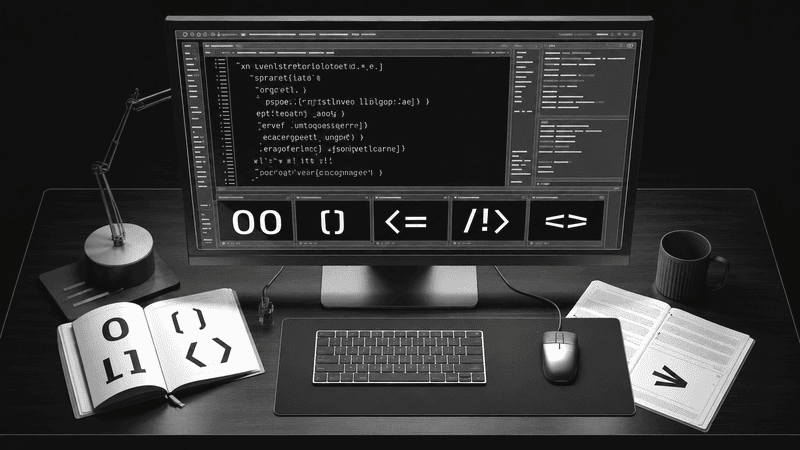
Every developer eventually becomes obsessed with fonts.
It usually starts with the default editor font. A few weeks later you’re downloading half the internet trying to find “the perfect one.”
Good programming fonts don’t make you a better engineer, but they can make reading code easier, reduce fatigue, and help you spot bugs faster. Small details such as the difference between 0 and O, or l and 1, matter far more than most people realize.
This guide covers the best coding fonts available in 2026, explains what makes a font great for programming, and helps you choose the right one for your workflow.
What Makes a Great Coding Font?
Before looking at individual fonts, it’s worth understanding what separates an excellent programming font from an average monospace font.
The best coding fonts usually provide clear character distinction, comfortable spacing, readable punctuation, useful weights, sufficient language coverage, and reliable rendering at small sizes.
- Compare 0 with O, 1 with l and I, and paired punctuation such as () [] {}.
- Check the font at your actual editor size and operating-system scaling.
- Inspect comments, strings, numbers, diffs, logs, and dense nested code.
- Confirm that italics and ligatures can be disabled when they become distracting.
- Verify the language, Unicode, and terminal symbols your workflow requires.
- Read the license before bundling a font into a product or website.
Different developers prioritize different features. Some hate ligatures, while others refuse to work without them.
There isn’t one perfect answer.
1. JetBrains Mono
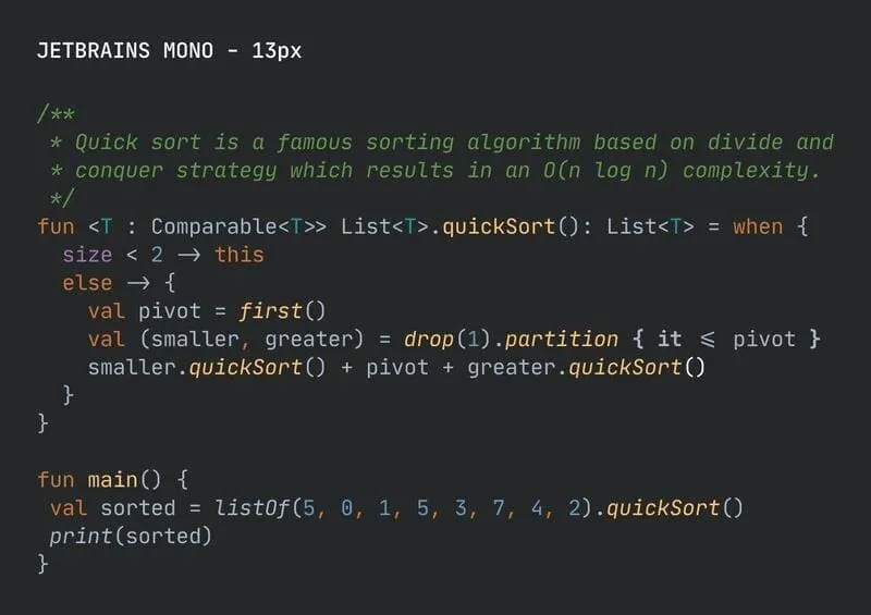
Probably the safest recommendation in 2026.
Created specifically for developers, JetBrains Mono has become one of the most popular programming fonts in the world.
Its characters are intentionally taller than many competing fonts, making code easier to scan without increasing font size.
Highlights:
- Free and open source
- Excellent readability
- Beautiful italics
- Programming ligatures
- Large language support
Website: JetBrains Mono
Best for:
- VS Code
- JetBrains IDEs
- Neovim
- Terminal users
2. Berkeley Mono
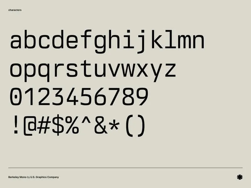
Berkeley Mono is widely considered one of the most beautiful commercial coding fonts ever created.
It takes inspiration from classic terminal typography while adding modern spacing and exceptional character design.
Pros:
- Premium quality
- Outstanding italics
- Fantastic punctuation
- Beautiful symbols
Cons:
- Paid license
Website: Berkeley Mono
3. Geist Mono
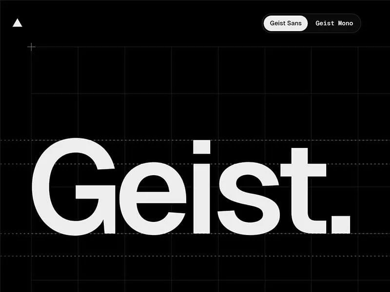
Originally developed for Vercel, Geist Mono quickly became a favorite among frontend developers.
It looks clean, modern, and minimal without trying too hard.
Why developers like it:
- Open source
- Great for React projects
- Excellent readability
- Looks fantastic in dark themes
Website: Geist Mono
4. Fira Code
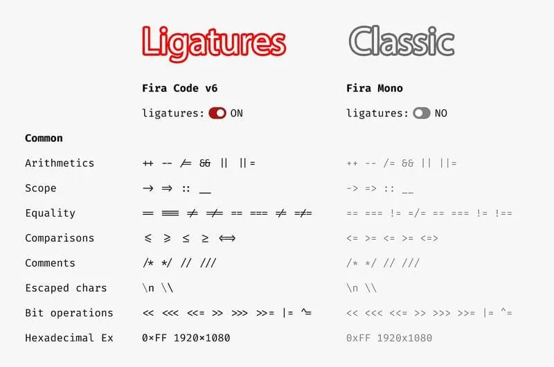
Fira Code popularized programming ligatures years ago and remains incredibly popular.
Instead of displaying:
===>
!=
<=
it can render them as elegant combined symbols.
Not everyone likes ligatures.
Fortunately, every editor allows you to disable them.
Website: Fira Code
5. Cascadia Code
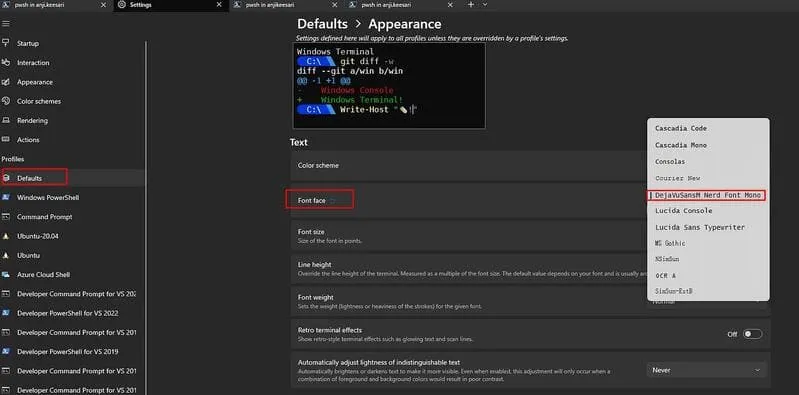
Created by Microsoft for Windows Terminal.
It has become one of the default choices for Windows developers.
Strengths:
- Free
- Excellent Unicode support
- Smooth rendering
- Great terminal experience
Website: Cascadia Code
6. IBM Plex Mono
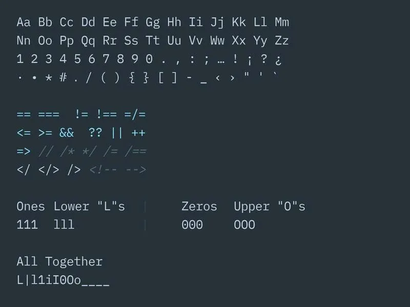
IBM designed Plex to replace Helvetica as its corporate typeface family.
The monospace version is particularly well suited to programming.
Characteristics:
- Professional appearance
- Clean punctuation
- Easy to read comments
- Excellent documentation font
Website: IBM Plex
7. Iosevka
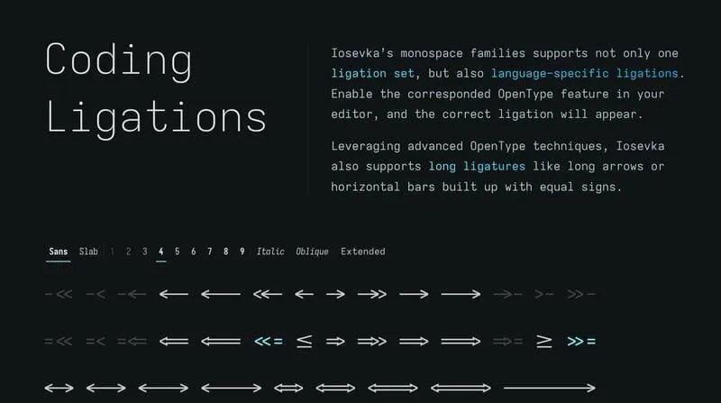
If you want maximum information density, Iosevka is hard to beat.
It’s narrow without feeling cramped.
Many terminal enthusiasts swear by it.
Features:
- Highly customizable
- Compact
- Huge Unicode support
- Open source
Website: Iosevka
8. Monaspace
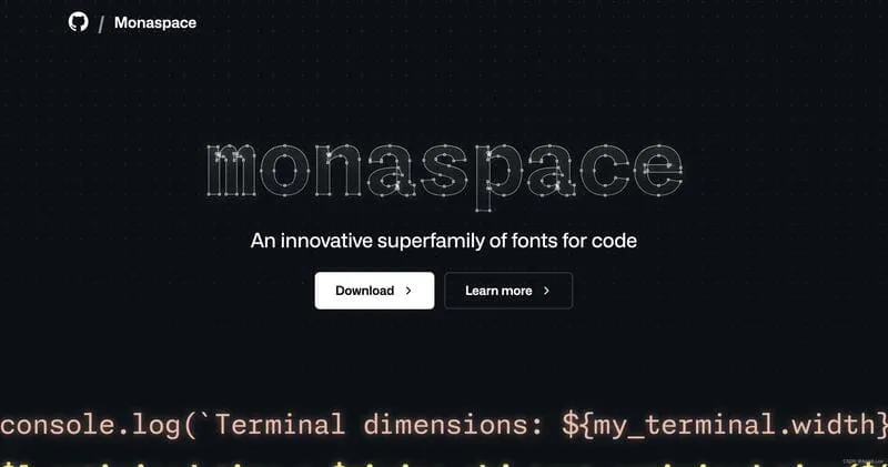
GitHub introduced Monaspace as an entire family of programming fonts.
Instead of one font, you get several personalities:
- Neon
- Krypton
- Xenon
- Argon
- Radon
Each one serves a slightly different purpose while remaining compatible.
Website: Monaspace
9. Hack
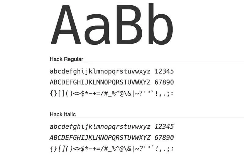
Hack remains one of the easiest fonts to read during long programming sessions.
Many Linux distributions ship with it by default.
Pros:
- Stable
- Free
- Clear punctuation
- Excellent zero character
Website: Hack
10. Source Code Pro
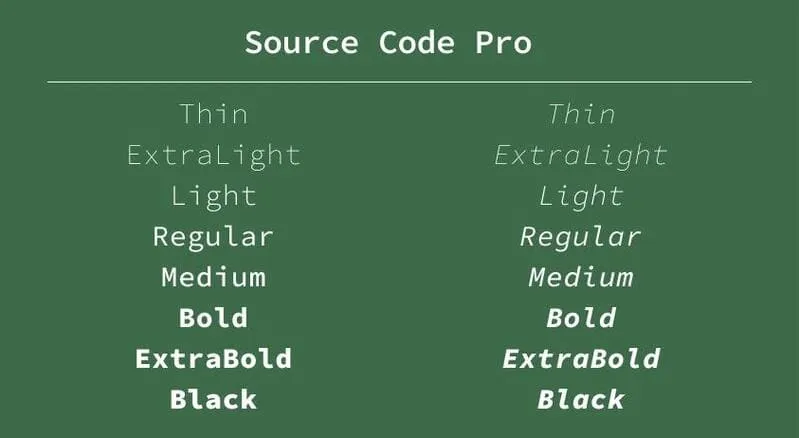
Adobe’s Source Code Pro has been around for years, yet it still feels modern.
Its balanced spacing makes it particularly comfortable for large codebases.
Website: Source Code Pro
11. Victor Mono
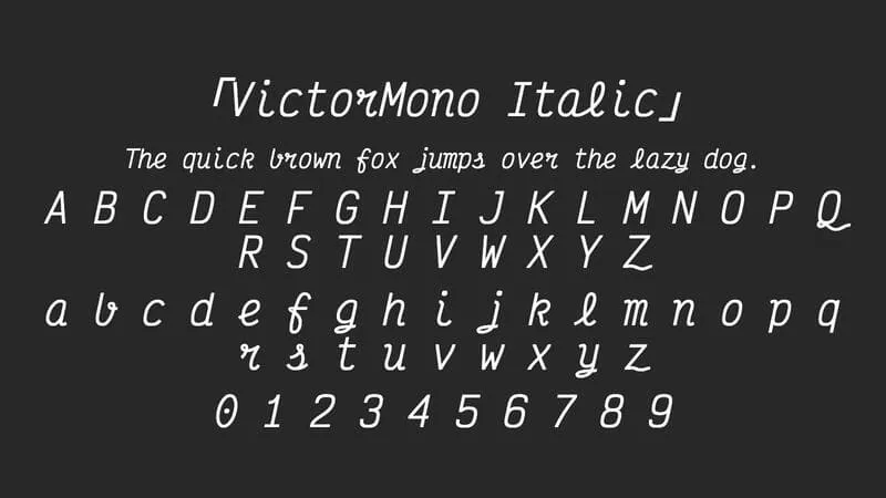
Victor Mono is famous for one thing.
Its beautiful cursive italics.
Some developers love them because comments become visually separated from executable code.
Others find them distracting.
Website: Victor Mono
12. Commit Mono
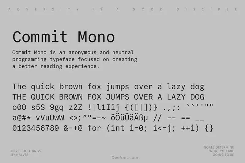
Commit Mono is relatively new compared to many fonts on this list.
It focuses on readability while maintaining a clean modern appearance.
Highlights:
- Open source
- Great spacing
- Excellent punctuation
- Modern look
Website: Commit Mono
13. Maple Mono
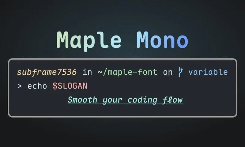
Maple Mono has gained popularity among developers who enjoy minimalist aesthetics.
It includes multiple variants and optional ligatures while remaining highly readable.
Good for:
- VS Code
- Neovim
- Kitty
- Ghostty
- WezTerm
Website: Maple Mono
Which Font Should You Choose?
If you’re unsure where to start, these recommendations are hard to beat.
| Use Case | Recommendation |
|---|---|
| Overall Best | JetBrains Mono |
| Most Beautiful | Berkeley Mono |
| Best Free | Geist Mono |
| Best Ligatures | Fira Code |
| Best Terminal | Cascadia Code |
| Most Compact | Iosevka |
| Best Comments | Victor Mono |
| Premium Experience | Monaspace |
Font Size Recommendations
Choosing the right font is only half the story.
Many developers find these settings comfortable:
| Display | Font Size |
|---|---|
| 1080p | 14-15 px |
| 1440p | 15-16 px |
| 4K | 16-18 px |
| Ultrawide | 15-17 px |
Also consider increasing line height slightly.
A line height between 1.4 and 1.6 often makes large files noticeably easier to read.
Should You Use Ligatures?
Programming ligatures combine character sequences such as:
=== != <= >= => -> <-into single glyphs.
Ligatures enabled
- +Operators can become easier to recognize
- +Adds visual personality to the editor
- +Source characters remain unchanged
- +May hide the exact shape of a character sequence
Ligatures disabled
- +Every typed character remains visible
- +Useful for teaching and close syntax review
- +Consistent with plain-text environments
- +Long operators can look more visually noisy
Some developers find this improves readability because operators become easier to recognize.
Others prefer seeing every individual character exactly as typed.
The good news is that most modern editors allow ligatures to be enabled or disabled with a single setting.
There is no universally correct choice.
Useful Tools for Testing Typography
Use representative code rather than a font specimen alone. Try long lines, nested objects, comments, punctuation, and both light and dark backgrounds before settling on a configuration.
Final Thoughts
The best coding font is the one that disappears while you work.
If you’re constantly noticing the typography instead of your code, it probably isn’t the right fit. A great programming font feels natural after a few hours and lets your attention stay on solving problems instead of deciphering characters.
Start with JetBrains Mono, Geist Mono, or Cascadia Code if you’re looking for reliable defaults. If you enjoy experimenting, try Berkeley Mono, Monaspace, or Iosevka. After a week of real development, you’ll quickly discover which font matches the way you read and write code.
Frequently Asked Questions
What is the best coding font for most developers?
JetBrains Mono is a strong default because it is free, readable at common editor sizes, actively maintained, and includes optional ligatures. Your display, editor, and preferred character width still matter.
Are programming ligatures better for coding?
Ligatures are a preference rather than an objective improvement. They can make operators easier to recognize, while disabling them keeps every source character visually explicit. Test both modes with your own code.
What font size should I use for programming?
Start around 14 to 16 pixels on a typical desktop display, then adjust for viewing distance, resolution, scaling, and eyesight. A line height between 1.4 and 1.6 is often a comfortable starting point.
Should a coding font be monospace?
Most editors work best with monospace fonts because aligned characters make indentation, tables, diffs, and columns easier to scan. Proportional fonts require more specialized editor support.
Which coding font is best for a terminal?
Cascadia Code, JetBrains Mono, Hack, Iosevka, and Monaspace are useful starting points. Check box-drawing characters, powerline symbols, ambiguous glyphs, and rendering at the terminal size you actually use.
How long should I test a programming font?
Use it for several normal working sessions. Review dense code, comments, logs, diffs, punctuation, and ambiguous characters instead of choosing from a single specimen image.